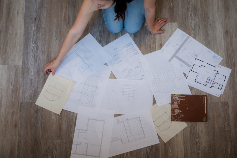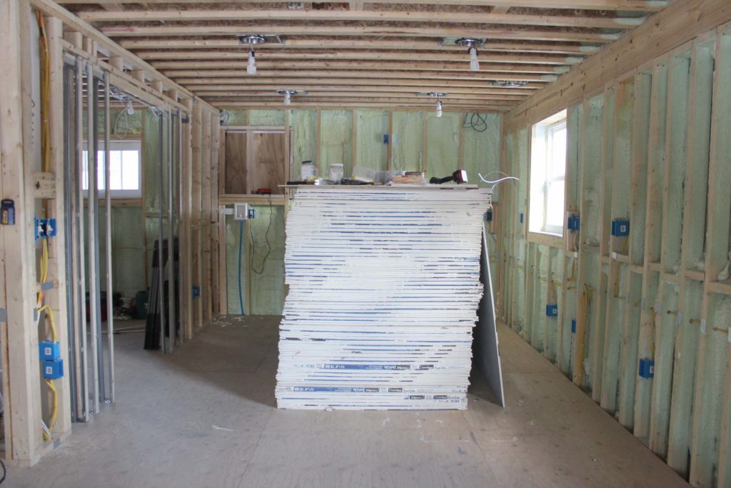
I literally cannot believe that Brandon and I are nearing the end of this full house renovation journey. Brandon recently described it as approaching the light at the end of the tunnel. We are so c l o s e. If you have been receiving my monthly email newsletter, then last month you got a sneak peek of our kitchen cabinets. (How beautiful are they??) I have been filming the entire cabinet assembly, so when the time comes, you will see that video. For now, as we continue to chip away at this project, I thought I’d share some photos of other kitchens that influenced us.
My Top 5 Kitchen Inspirations:
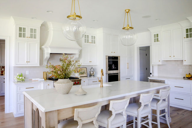
Photo by Lee Owens Design
What I love most about this kitchen designed by my friend Lee Owens, is how light and bright it feels. The brushed brass accents for the hardware, faucets and light fixtures add a classic feel. Much of what you see now in a brand new kitchen is a stainless steel hood directly above the range. Brandon and I think that’s a total eye sore so we opted for a white one. I appreciate Lee’s aesthetic for this hood by having it blend in with the cabinets.
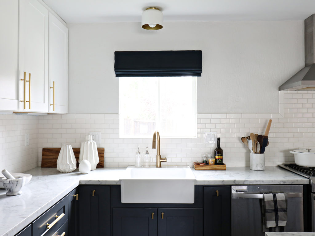
Photo by Brittany Chinaglia, The Vintage Rug Shop
Of all the kitchens I’ve seen online, this one has probably influenced me the most. The color scheme, sink, counter and overall vibe is how I want our kitchen to feel. The cabinet colors we decided on are two tone, similar to these. The sink sits in front of a large window, with the dishwasher to the right. Brandon and I found a Kohler farmhouse sink over 2 years ago at the Habitat for Humanity ReStore. It was brand new, still in the box. We were no where close to the kitchen 2 years ago, but we bought it anyway knowing we would fit it into the design. Also love the brushed brass hardware here!
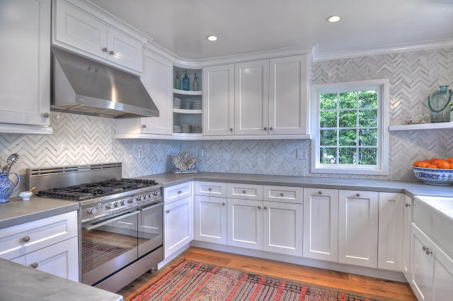
Photo by Kathleen DiPaolo Designs
This image above jumped out at me when I saw it on Pinterest. The non-standard over-sized stove, the herringbone backsplash and concrete counters are all major players in our kitchen. I also like that the hood above the stove is more compact, much like ours. While Brandon and I haven’t settled on backsplash tile yet, this certainly calls out at me as a contender.
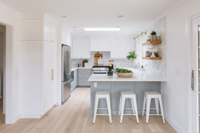
Photo by Studio McGee
When I saw this photo by Studio McGee, it was as if I was standing in my dining area looking at my own kitchen. The peninsula, the two-tone cabinets, the sink and stove location and the vibe of the backsplash. A major difference in this kitchen is the location of the fridge. Can I please just plop myself into this photo and call it a day?
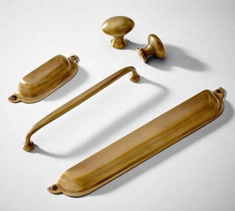
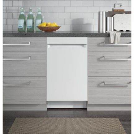
This hardware by Pottery Barn is what we are aiming for. We also decided on an 18″ dishwasher from GE.
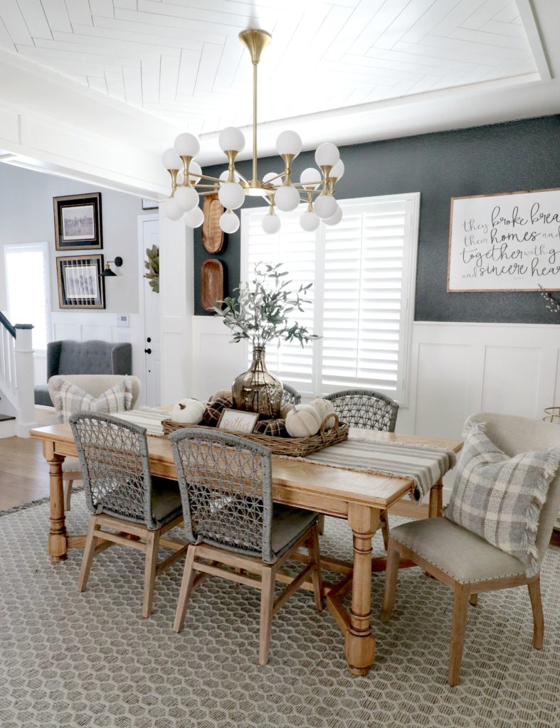
Photo by Jordan, House Becomes Home Interiors
This photo is a bonus because I am completely obsessed with this light fixture from House Becomes Home Interiors. When Jordan posted it on her Instagram page, I could not get it out of my head! Mind you, the price is steep (over $2000) so it’s not an option for us right now or probably ever. However! I did manage to find a beautiful vintage dining light fixture at an estate sale this fall. Actually, it was Brandon who found it! It was a whopping $5 and it’s gorgeous.
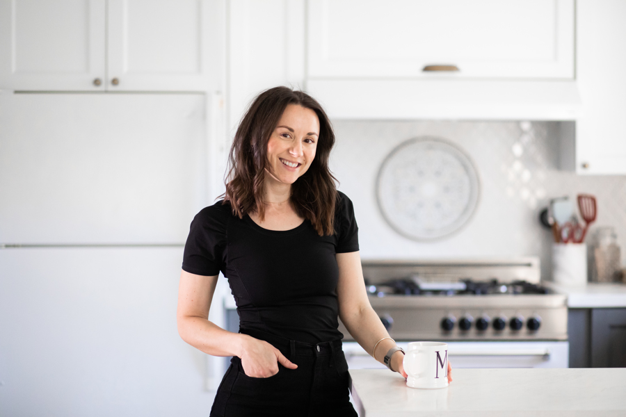
It hasn’t quite set in yet that soon we will no longer be prepping out of a closet kitchen. I’ve been waiting for this for over 4 years, and now that we are so close I’m feeling a bit nostalgic. All we have remaining to do in the kitchen is our countertops. That’s it! Can you believe it???
By the way, you should totally sign up for my monthly email newsletter! I share bits and pieces of what we do on the house and photos that I don’t post here or on social media. All you need to do is fill out your name and email below!
[mc4wp_form id=”6173″]

